Real Estate Development
Adobe Illustrator - logo creation & identity system
Adobe Photoshop - packaging visualization & mockups
Figma - layout design, presentation & digital mockups
Pencil + Sketchbook - initial concept development
In Design -print layouts
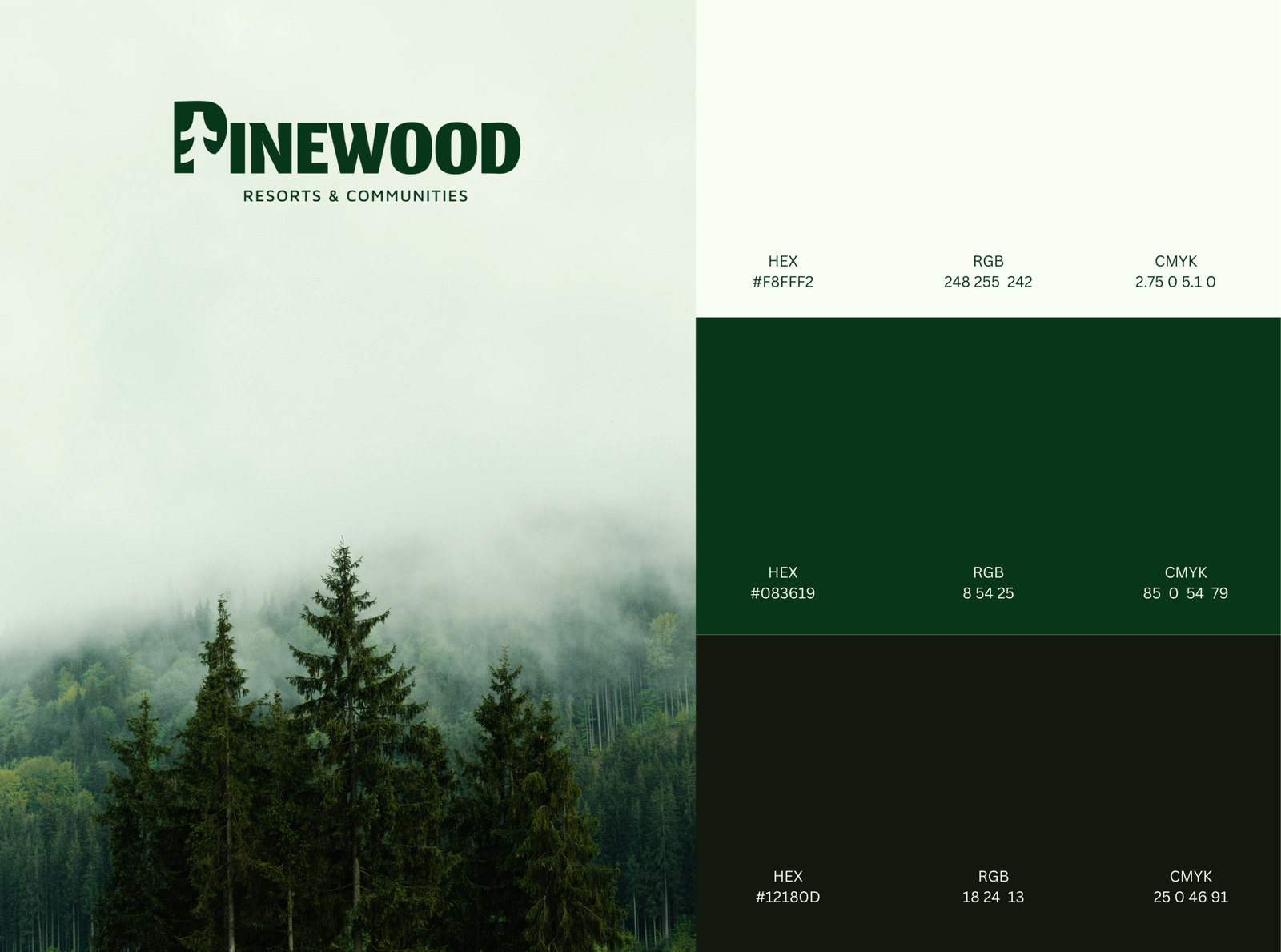
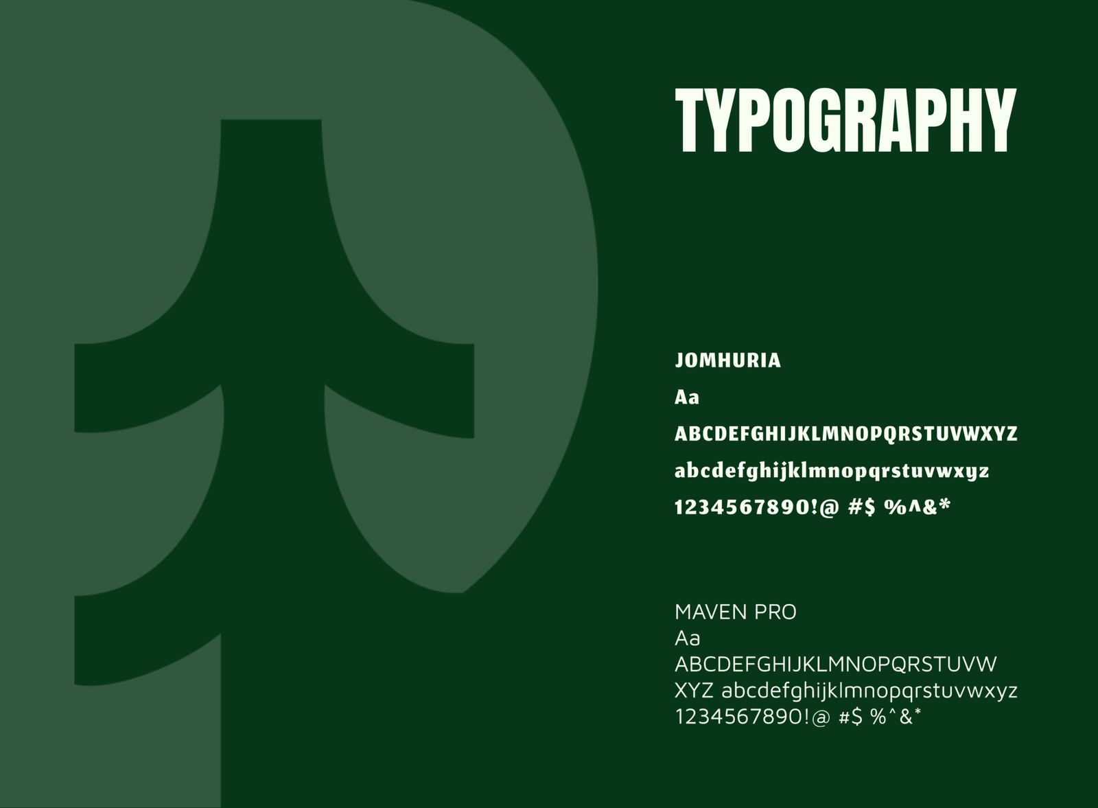
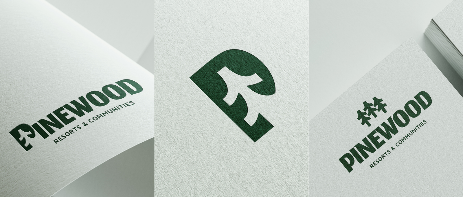
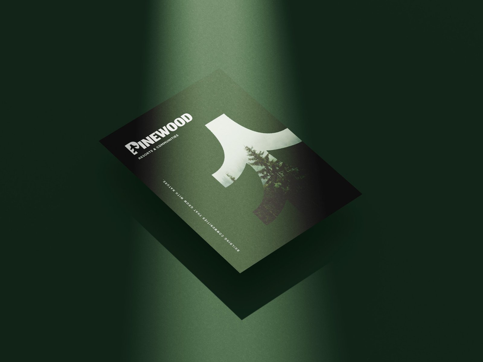
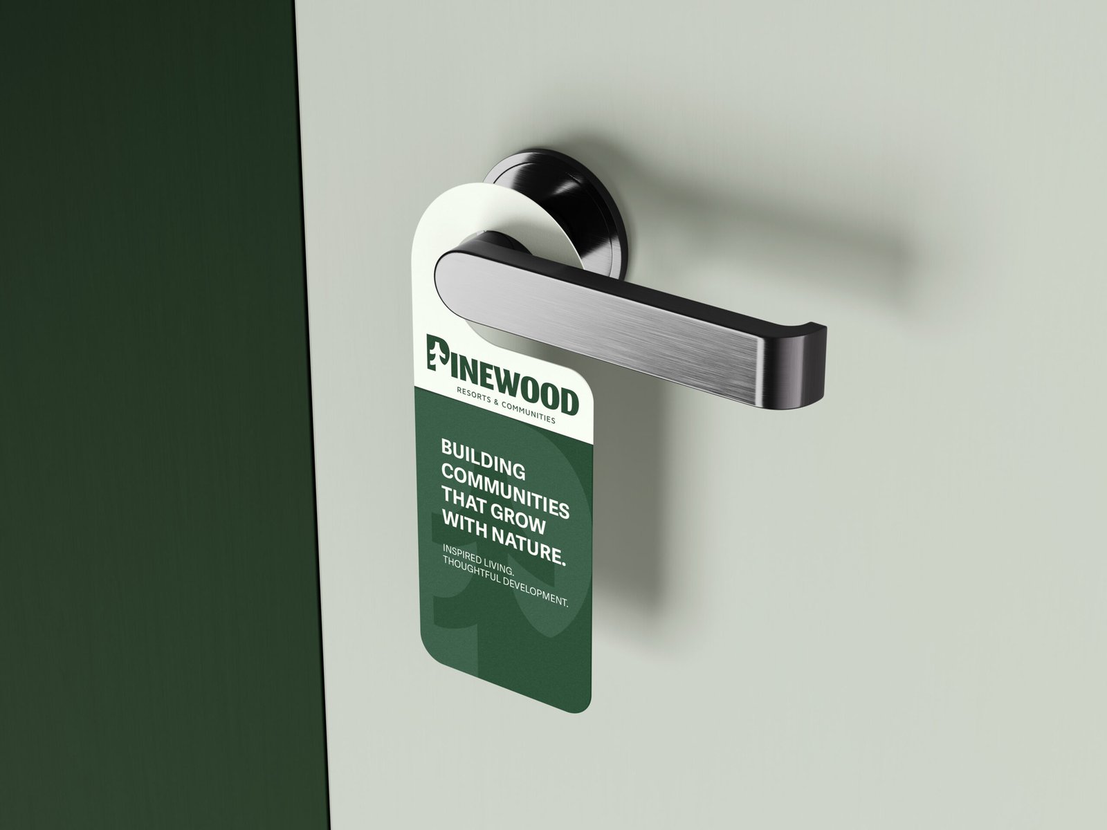
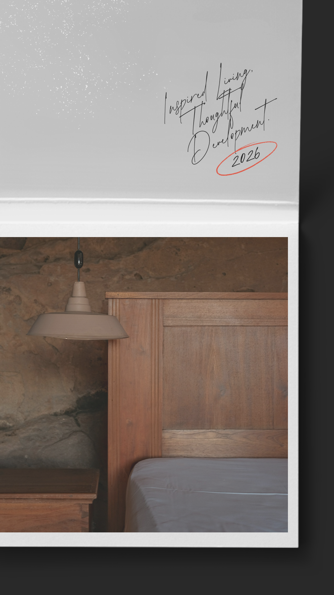
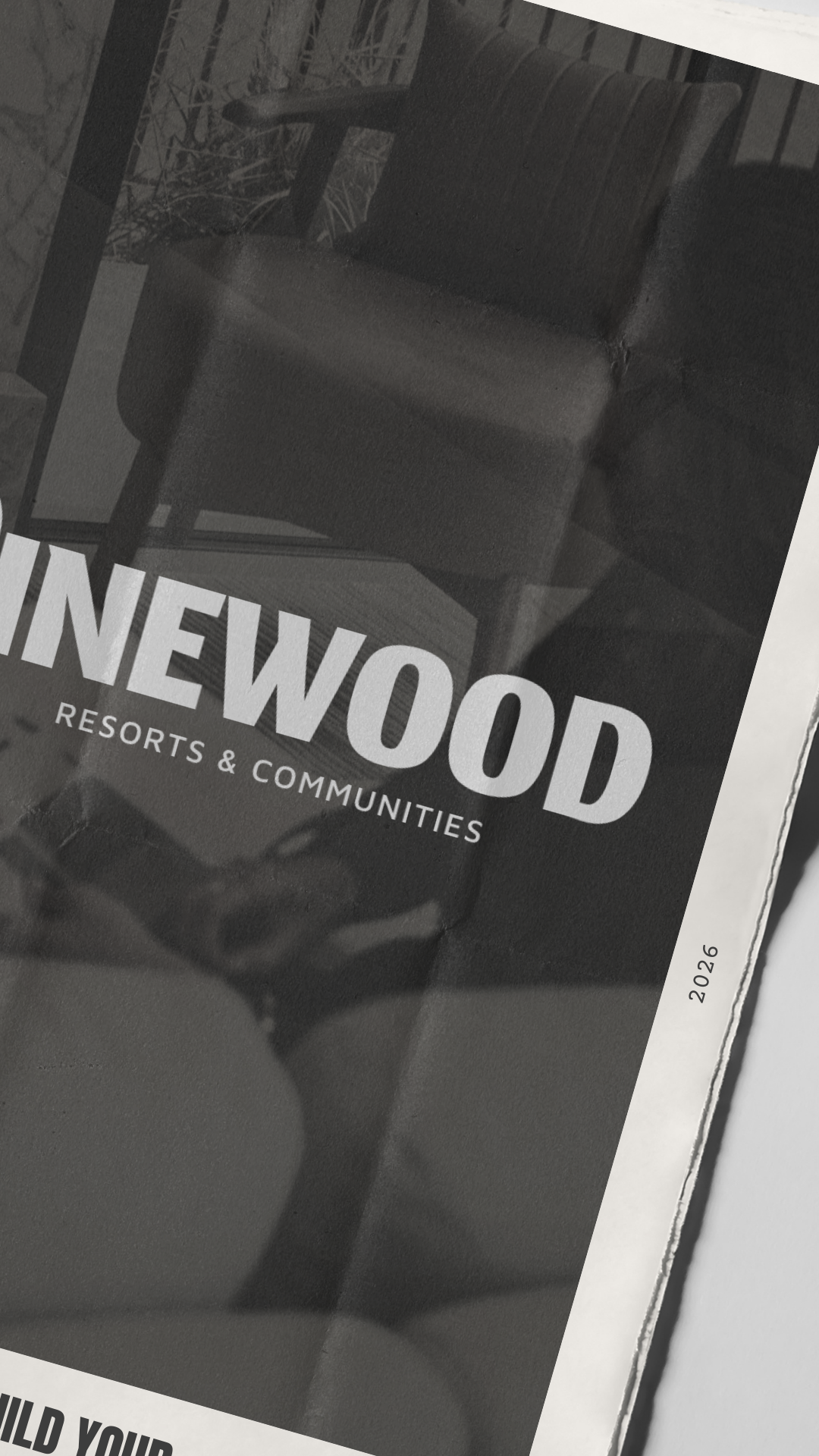
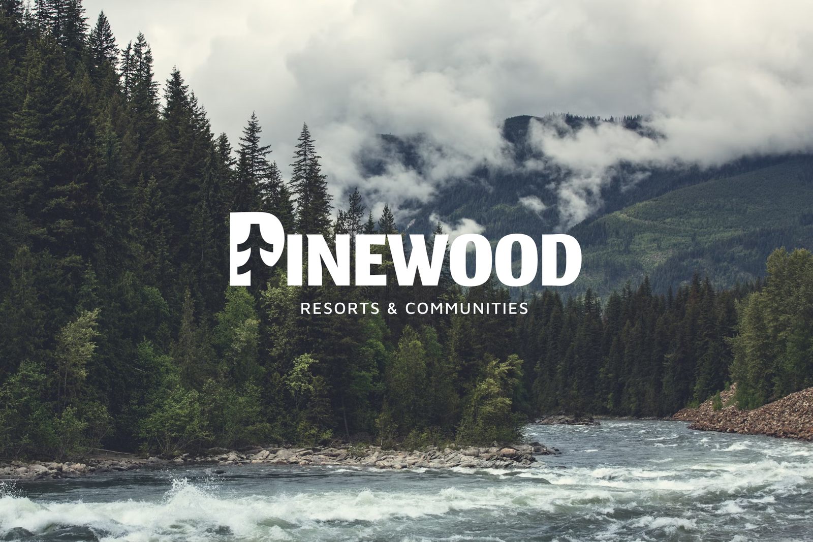
I began with research into resort and development brands to understand how they balance trust, nature, and modern living. From there, I sketched early logo concepts by hand, exploring how the letters could subtly echo the shape of a pine tree. I refined the strongest directions in Adobe Illustrator and built a cohesive brand system including typography, color palette, and layout style. Final applications were presented through minimal mockups created in Photoshop and Figma to reflect a premium, timeless aesthetic.